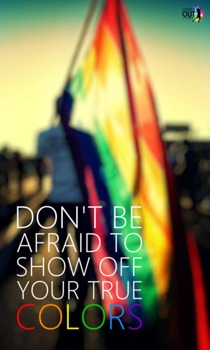
“Don’t be afraid to show off your true COLOR”
“Don’t be afraid to show off your true COLOR”
Each color has its own vibrational energy that is absorbed into the skin through our aura.
This means that the color of the clothes we wear, color in home, in the office, and garden and the food we eat affect us in different ways.

The following discussion I will explain the science of color and how each primary color affects our physical, mental, and spiritual.
I will teach you how to maximize the benefits of color therapy in your life effectively, using practical techniques, such as meditation, visualization, solarization.

We can not be apart from the color. Color is all around us and is continuing to deliver a great influence, even without realizing it.
Color is a form of energy, in contact with us through the aura-electromagnetic field that surrounds our body. The clothes we wear, the food we eat, colorful in our homes ….
affects us all, whether we realize it or not.
You do not have to be able to see the colors to the color effect and benefit you.
that is why people were affected by the color blind in the same ways as those who see.
Our bodies react to light colors and use them in various ways as needed.
This discussion explains the power of color in your life, helping you to be more aware of the influence of each color for you, teach you how to use color to improve your life, brighten mood, increase creativity, help you sleep nyeyak, creating a pleasant home, and connect you with spiritual world.
When you begin to realize the benefits of various colors, your life will be more meaningful, spiritual terutamatingkat you will be more in depth.
You will also learn how to use warnauntuk therapy improve health.

well …. it is an introduction to my next discussion,
The discussion is about “COLOR THERAPY”
not to be missed, will be in edit / publish soon ….!!
Only on this blog “The color of Living”

KNOWN FENG SHUI
Feng shui at the present time is still a reference point for some people to build houses.
Are you one of them?
Just history, feng shui was born about 5000 years ago in mainland china. feng shui means wind and water is. Is a science that aims to harmonize yin and yang, two natural energy
opposite.
Feng Shui word itself, derived from a combination of the word Feng means wind (direction) and Shui means water
(place). If analyzed from the Feng Shui, it is likely that the science is already there and growing even before the ancient Chinese people know the compass, where the determination of a good place at first only see a mix of water and wind elements alone.
Since ancient times, Chinese people have been using Feng Shui as prompts. As the development time, many books on Feng Shui contains market. That is, to facilitate the Chinese community to start or run a business.
Feng shui is the science now not only studied and believed by the Chinese community, even this is not uncommon this science learning in asia, america, europe and around the world.
To make it happen, feng shui has some formulas. Ancient feng shui expert, making Pa Kua, the eight cardinal directions diagram, in which there are figures. Pa Kua determine the direction toward the man, a good way and a bad way.

Note:
For Pa Kua formula I will discuss at a later time, just when many requests from visitors to this blog. Please leave your message if you want me to discuss about the formula Pa KUA.
Minimalist house paint color selection based on Feng Shui may be a little confusing for those of you who do not know the meaning of each color.
Here is a chart so that you can understand the elements of color and meaning of each color.
As one of the worldwide Chinese culture, Feng Shui is believed to affect a variety of things, including residential business or residence. If explored in terms of architecture, some of the traditional knowledge is also sometimes related to each other and connect. For example how an architect swap the home, the location of the window, where the light enters, and so on look from solar sources, as well as attention to environmental conditions.
Paint colors for a minimalist home affairs, Feng Shui also have guidelines that you can apply just to find the right color references, or did you believe these colors can evoke certain energy in your home.
In feng shui, color is vibration. Vibration response is always, consciously or not. Color affects the comfort and mood. The colors we wear everyday influence the views of others towards us. Here are some character color according to feng shui:
RED


The color red has a fire element, and the effects are spirit therein. Its use would be very appropriate if combined with bright colors such as white, or given other dark color accents such as black, for a balance of color.
PINK


Bringing elements of earth, pink is often associated with love or a relationship. Suitable to be applied in a room with white color variations.
GREEN


Green paint colors minimalist home means bringing the wood element, which has a natural atmosphere and the spirit of life. The green color is also appropriate for study room, den, office, or living room.
PURPLE


Purple believed to contain elements of wind and has a positive correlation with wealth, prosperity, glory, or something that is elegant.
Mixture of purple and blue that produces lavender color, is also believed to help reduce stress, making it suitable for interior room.
BLUE


The blue color brings the element of water, giving rise to the effect of calmness. Some of the color blue is often used for minimalist interior design is donker blue, navy blue, and dark blue with a mixture of black that produces imaginative atmosphere, soothing, and help relax. Bathrooms are using fresh blue color also can be look more fresh.
WHITE


White is a neutral color and most widely used as the main color and companion when determining color minimalist home. White brings an element of “metal” that give creative effects, and help to achieve focus. White color can be combined with other appropriate colors such as gray, red, purple, orange, etc..
YELLOW


Yellow is also one of the favorite colors to complement the interior design of the house. Bringing elements of earth, yellow meant to bring positive energy associated with health. Not only physically, but it is believed that the game proper yellow color can also help maintain mental health conditions to remain stable.
GREY


By themselves, the color gray is often dull impression. Not only for homes, but also for fashion. But if given a touch of another color matching, then the combination of these can produce a beautiful harmony. Gray color gives the impression of calm and stable.
BLACK


Although many have a poor correlation, but black can be used as an accent color to give the impression that attractive classic or elegant.
From all the information I provide,
decision in your hands, you can believe it or not …
hopefully useful!!!
There is creative reading as well as creative writing.
~Ralph Waldo Emerson~

Colour is a powerful and important communication tool, and it is tied to religious, cultural, political and social influences.
By stopping to consider what each colour represents and is linked to in the ‘real world’ we can make informed design decisions that ensure we appeal to our target audience. Without this consideration we run the risk of offending the very people were are designing for.
#1 IT AFFECTS YOUR MOOD
Most of us have a favourite colour or prefer some colours over others. This is because can affect our moods so we surround ourselves in the colours that have a positive impact on our mood.
Red can boost your energy, yellow often makes people feel happier, and blue is proven to bring down blood pressure and slow your heart rate which is why it is often associated with being relaxing. If you combine the happiness of yellow and the relaxing feel of blue you get green, a very pleasing colour for many people.
Mental health units are known to use pastel tones on their walls so that patients feel calm, happy, and relaxed. Walls that are beige with a pink tint combined with mint green floors are a popular combination as it is said to create a soothing, harmonious and calm area. At the other end of the spectrum, literally, schools tend to user bright colours that appeal to children.
When choosing colours for your next design it is important to consider how they will combine and sit with the other elements on the page and what impact that will have on the mood of your audience.
#2 COLOURS COMMUNICATE INVISIBLY
Wassily Kandinsky was one of the first pioneers of colour theory. A renowned Russian painter and art theorist, he is often considered the founder of abstract art. Kandinsky believed the following colours communicate the following qualities:
Yellow – warm, exciting, happy
Blue – deep, peaceful, supernatural
Green – peace, stillness, nature
White – harmony, silence, cleanliness
Black – grief, dark, unknown
Red – glowing, confidence, alive
Orange – radiant, healthy, serious
#3 COLOUR HAS CULTURAL SIGNIFICANCE
Different colours mean different things in different places. This is extremely important for designers to know because without an awareness of the cultural significance of a particular colour, you risk offending your entire target audience.
Purple for example is a colour of mourning in Thailand. In western culture however, it is associated with royalty, luxury, wealth and sometimes magic. The brand colour for Thai Airways is purple. On first glance this seems like a huge error on their part because as mentioned above, purple is a colour of mourning in Thailand.
It is most likely however, that the Thai Airways website isn’t aimed at locals but at tourists, therefore if westerners view the site and see purple it will associate Thai Airways with values such as luxury and comfort.
Other examples are:
In western cultures black is a colour of mourning
In Japan however it is a colour of honour, with white the colour of mourning
Red in the west represents danger, love, passion
In India it is a colour of purity, in China it is a colour of good luck and in South Africa it is a colour of mourning
Yellow represents courage in Japan, mourning in Egypt and hope in the West
#4 COLOUR CAN BE INSPIRED BY OUR SURROUNDINGS
We live in a colourful world, a world that acts as the perfect inspirational trigger for design. The best thing about looking to the environment for design solutions is that the palette is always changing, from autumnal oranges to cold winter blues. So where better to look than out of your window, take in the colours and then apply them to your designs.
Drawing inspiration from nature for your designs also makes you look at the world differently. Normally we whiz by from place to place but you notice the finer details and undiscovered gems when you actually stop to take it in.
#5 COLOUR HAS POLITICAL ASSOCIATIONS
Individual political parties are associated with one colour or another. Depending on whom your audience is, this might prove to be valuable information when designing.
The association between political parties and colours isn’t a new connection but it is often taken for granted. In the UK for example the following pairings exist:
Labour – Red
Conservative – Blue
Liberal Democrats – Yellow
The Green Party – Green
If a colour is representative of a political party then the values and behaviours that the party is known for can be suggested through the use of this colour.
Red is often linked to socialism and communism
White has links to pacifism and the surrender flag. In contrast to this, black is a colour that is used in conjunction with anarchism.
Working class Nazism is associated with the colour brown as the SA were known as the ‘brownshirts’.
A design with one of these colours as the dominant shade may well hint at a right wing or a left wing preference or at extreme behaviours.
#6 RELIGION CAN BE LINKED TO COLOURS
As with politics, colours are representative of certain religions. So as not to unintentionally offend anyone through your designs, some examples of these colour/religion associations are:
Green is considered to be the holy colour of Islam
Judaism is represented by the colour yellow
In Hinduism, many gods have blue skin
White is linked to peace across many religions
Again this may only be necessary information if you are designing a site that has specific links to religion but it also emphasises that a thorough knowledge of your audience is a fundamental part of the design process.
#7 AGE AFFECTS PEOPLE’S COLOUR PREFERENCES
Colour expert Faber Birren carried out many studies into this area and in his book Color Psychology and ColorTherapy, he states that for both genders, blue and red “maintain a high preference throughout life”. He found that yellow is popular with children but as become move into adulthood it shows less popularity. Birren found that “with maturity comes a greater liking for hues of shorter wave length (blue, green, purple) than for hues of longer wave length (red, orange, and yellow)”
Another factor that influences people’s colour preferences is that throughout their life there will be social and cultural changes and this can directly impact on their favourite colours. Some knowledge of what colours certain age ranges prefer can be valuable for designers. If you were designing a website for a toy store or a children’s TV channel, then knowing they prefer bright colours and yellow in particular would help with your design decisions.
Likewise, if you designed a website for a charity whereby the audience was to be the older generation then blue, green or purple might be ideal, based on Birren’s findings.

CONCLUSION
Colour is a complex subject with many strands and it has the power to subliminally convey values and stories. Please share your thoughts and opinions about colour, in the comments below.
Different colors evoke different reactions in viewers. Be aware that some of these reactions will be culturally specific. For example, in the U.S., brides often wear white as a symbol of purity and widows wear black as a symbol of mourning. However, in many Asian cultures, brides wear black. The following is a guide as to the possible meaning of colors.

Red – danger, stop, negative, excitement, hot
Dark Blue – stable, calming, trustworthy, mature
Light Blue – youthful, masculine, cool
Green – growth, positive, organic, go, comforting
White – pure, clean, honest
Black – serious, heavy, death
Gray – integrity, neutral, cool, mature
Brown – wholesome, organic, unpretentious
Yellow – emotional, positive, caution
Gold – conservative, stable, elegant
Orange – emotional, positive, organic
Purple – youthful, contemporary, royal
Pink – youthful, feminine, warm
Pastels – youthful, soft, feminine, sensitive
Metallic – elegant, lasting, wealthy
The Colors You Wear Can Reflect Your Emotional State
Wearing the wrong color can make you feel out of sorts with yourself.


one example of Harmonization :
when RED mixed with YELLOW produce ORANGE.


Everyone wants HAPPINESS.
no one wants PAIN.
but you can’t make a RAINBOW,
Without RAIN….

